

Watch Dials Explained: Colors, Finishes and Hour Markers
Black, blue, champagne, mother-of-pearl or full pavé, with Roman, Arabic or stick markers: what each dial choice does on the wrist.
Quick Facts
Four things make up a dial
The case and bezel get noticed from across a room. The dial is what you see every time you check the time, dozens of times a day, so it pays to choose it with some care. When people describe a dial they are really talking about four separate choices:
- Color: the base shade of the dial plate.
- Finish: the surface texture, which decides how the color moves in the light.
- Hour markers: the numerals, bars, dots or stones that mark the hours, also called indexes.
- Hands: their shape, color and finish. They decide legibility more than anything else on the dial.
Get the first three right for your taste and the fourth right for your eyes, and the watch will be easy to live with.
Dial colors and how they wear
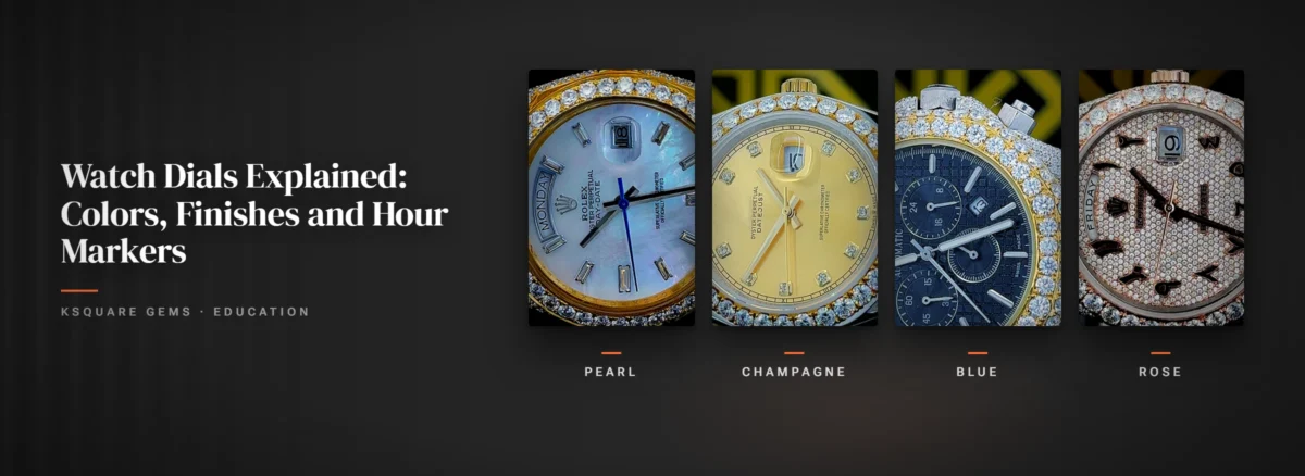
Black is the safe choice for good reasons. White or stone-set markers stand out sharply against it, and it suits steel, yellow gold and rose gold equally. On an iced watch a black dial also makes the bezel stones look brighter by contrast.
Blue is the most changeable color. A sunburst blue can look electric in daylight and close to navy indoors. It pairs naturally with steel and white metals, works with denim and navy tailoring, and looks rich next to yellow gold on a two-tone case.
Champagne is a pale, warm gold. It belongs with yellow gold and two-tone cases and looks quietly dressy. The trade-off is contrast: gold hands on a champagne dial can blend in, so check that the hands are easy to pick out in the photos.
Mother-of-pearl dials are traditionally cut from nacre, the iridescent lining of certain shells, sliced into a thin layer. A pearl dial shimmers with pink, green and blue as you tilt it, and on shell dials no two patterns are quite the same, so expect any pearl dial to differ a little from the photo. It reads light and formal.
Green looks close to black in dim rooms and comes alive outdoors. If a full green dial feels like too much, green markers or accents add color without committing the whole watch to it.
Rose and red run from soft pink to coppery salmon to deep red. Rose shades sit best on rose gold or rose two-tone cases, where the dial and metal echo each other. Deep red is a statement color and works best as the one bold thing you are wearing.
Full pavé covers the whole dial in small stones. It is the most sparkle a watch can carry and the hardest dial to read, which we come back to below.

Finishes: what the surface does to the light
- Sunburst: fine lines brushed outward from the center. Light sweeps across the dial as you turn your wrist, so the color brightens and darkens. Most popular on blue, gray and green.
- Matte: flat and glare-free. The easiest finish to read and the most casual looking.
- Gloss or lacquer: a deep, mirror-like surface. Rich up close, but it reflects lamps and windows more than matte does.
- Mother-of-pearl: on a shell dial the shimmer comes from the layered material itself, not from any brushing.
- Pavé: stones set edge to edge across the dial, held by tiny beads of metal. See Stone Settings Explained for how pavé works.
- Openwork: parts of the dial cut away so you can see through to the mechanism or the layers underneath. Striking, but the busiest finish to read. Skeleton Watches has tips for reading one.
Hour markers
Roman numerals are the traditional, dressy choice. You will often see the four written as IIII instead of IV, a long-standing watch and clock convention rather than a mistake.
Arabic numerals are the most literal and often the quickest to read, which is why they turn up on sport and pilot-style dials. They can look busy when there are twelve of them.
Stick or baton markers are simple bars at each hour. When they are applied, meaning separate polished pieces fixed onto the dial rather than printed, they catch the light and give the dial depth. Clean and versatile.
Round markers are dots, often paired with a triangle or a double bar at 12. They have a sporty, dive-watch feel and are frequently filled with luminous paint, covered in Watch Lume.
Stone markers replace numerals or bars with a set stone at each hour, on our watches moissanite. They sparkle at every glance and read best against a plain, contrasting dial. On a pavé dial they can get lost among the other stones.

Legibility: why the hands matter most
You read the time from the hands, not the markers. Most people can tell the time from hand position alone, so the real question is whether the hands stand out against the dial at a glance.
Polished silver or gold hands are a classic look, but they reflect whatever is around them. On a black dial they flash bright and are easy to read. On a full pavé dial they reflect the stones underneath and can disappear at certain angles. Blackened hands, hands with a colored or luminous fill, or hands with a dark outline hold up much better on a busy dial.
| Dial | Legibility | Wears well with |
|---|---|---|
| Black | Very good | Almost anything, day or night |
| Blue sunburst | Good, dimmer indoors | Denim, navy, steel and two-tone |
| Champagne | Fair, check hand contrast | Yellow gold, warm tones, tailoring |
| Mother-of-pearl | Fair | Light colors, formal and summer outfits |
| Green or rose | Good to fair | Neutral outfits that let the color lead |
| Full pavé | Lowest | Plain outfits; the watch is the outfit |
| Openwork | Low to fair | Simple clothes that don’t compete |
Matching the dial to the metal and the outfit
The simplest rule is to let the dial pick up a color that is already on the watch. Champagne with yellow gold, rose with rose gold, black or blue with steel. When dial and case agree, the watch looks finished.
Then think about how loud the rest of the outfit is. A pavé dial with an iced bezel is a complete statement on its own, so it looks best with plain clothes and not much other jewelry. A black or blue dial with stone markers is easier to wear every day, including with a jacket. For more on combining metals, see Gold, Silver and Plating Explained.
Looking after the dial
The dial sits sealed under the crystal, so it never needs cleaning by you. Look after the outside and the dial looks after itself. The things that do damage a dial come from inside the case: moisture, dust or a loose part.
Our listings advise against wearing these watches while swimming or in the rain, and that matters for the dial as much as anything. For safe cleaning of the case and bracelet, read How to Clean an Iced Out Watch.
Frequently Asked Questions
Black or white with strongly contrasting hands. What matters most is the contrast between the hands and the dial, more than the color itself.
It is a long-standing convention on watch and clock dials. It is a deliberate design choice, not a mistake.
It is the hardest dial type to read, because polished hands reflect the stones underneath. Hands with a dark or colored fill help a lot.
A dial brushed with fine lines radiating from the center. Light sweeps across it as you move, so the color brightens and darkens with the angle.



Worldwide Delivery
Enjoy complimentary overnight shipping with fast delivery, ensuring convenience and prompt luxury service.
14 Days Returns
Experience peace of mind with our satisfaction guarantee, ensuring premium quality and unmatched customer service.
Lifetime Warranty
Shop with confidence, backed by verified trust ratings, secure transactions, and exceptional quality assurance every time.
24/7 Customer Support
We're here for you anytime, anywhere. Our dedicated customer support team is ready to assist you around the clock.